SMALL COLLECTIONS, USEFUL DECISIONS
Color palettes
with a purpose.
Start with a considered combination. Inspect its roles, test actual pairs and make it your own.
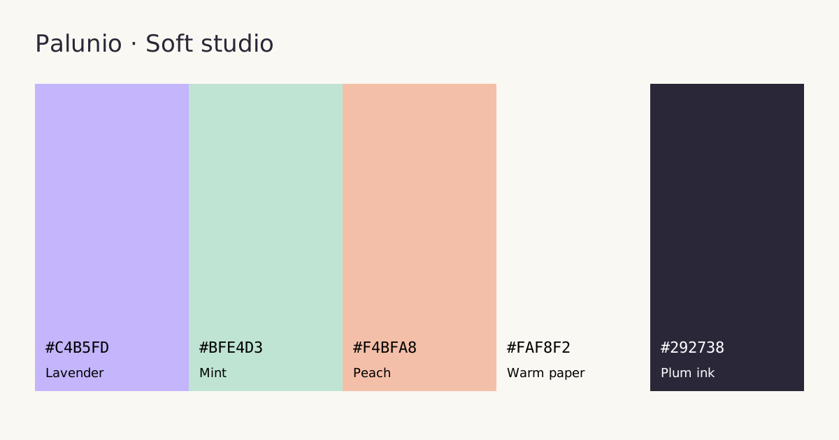
Soft studio
A pastel website palette with lavender, mint and peach, a warm surface, and dark ink. Includes measured contrast, CSS tokens and an editable preview.
Explore colors and pairings →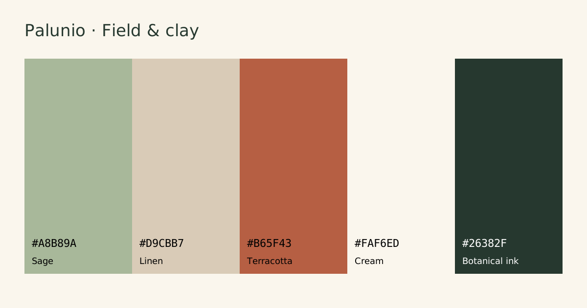
Field & clay
Sage green and terracotta HEX colors for a warm brand and website. Explore cream surfaces, dark botanical ink, real contrast pairs and downloadable tokens.
Explore colors and pairings →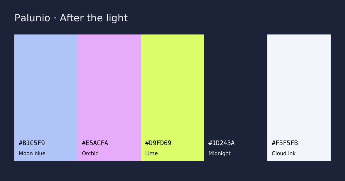
After the light
A dark website color scheme with blue, lavender and lime accents. Inspect exact HEX codes, measured text contrast, CSS exports and a live role preview.
Explore colors and pairings →Choose by the work the colors need to do
Pastels can soften a portfolio; sage and terracotta can support a warm brand; a dark scheme can frame a developer product. Each study includes a surface and an ink, not only decorative swatches. Compare the measured pairs before copying the exports.
These are original editorial starting points, not a claim that a palette is universally accessible or right for every brand. Learn how to test a palette in context or generate your own combination.