CURATED COLOR STUDY · Field & clay
Sage Green and Terracotta Brand Color Palette
Sage and terracotta sit on opposite sides of a warm botanical composition. Here, a muted green supports larger areas while a deeper clay color provides a smaller point of emphasis. Cream and dark green keep the scheme usable beyond a moodboard.
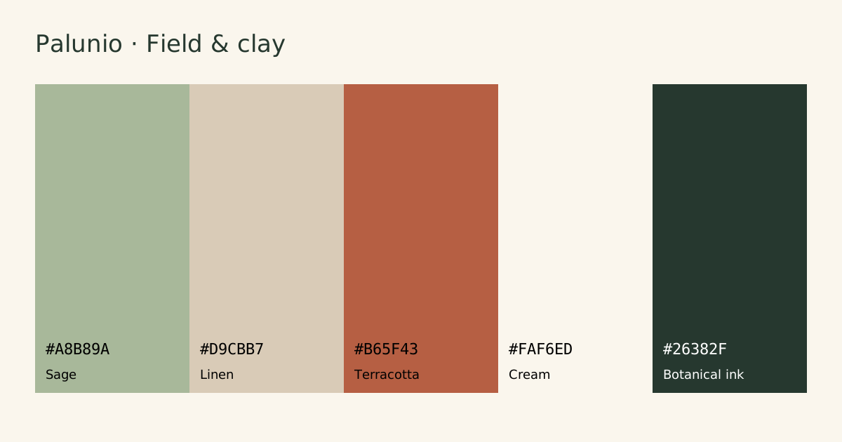
HEX codes and intended roles
| Color | HEX | Role |
|---|---|---|
| Sage | Primary | |
| Linen | Secondary | |
| Terracotta | Accent | |
| Cream | Surface | |
| Botanical ink | Ink |
How to use this combination
Start with cream for the page and botanical ink for long copy. Use sage for editorial panels and linen for quieter dividers or decorative objects. Terracotta is the accent: test the exact foreground on it before making it a button or a link.
A SMALL WEBSITE STUDY
Field & clay
Thoughtful details. A little room to breathe.
Explore the collection →Body text: 11.53:1 · CTA text: 4.71:1
Measured contrast pairs
Ratios use the WCAG 2.2 opaque sRGB formula. Normal text AA needs 4.5:1; large text AA needs 3:1. Labels use the full unrounded result. This table checks pairs, not full accessibility conformance.
| Pair | Ratio | Normal AA | Inspect |
|---|---|---|---|
| Body text on page | 11.53:1 | Pass | #26382F on #FAF6ED |
| Ink on primary | 5.91:1 | Pass | #26382F on #A8B89A |
| Ink on secondary | 7.80:1 | Pass | #26382F on #D9CBB7 |
| Ink on accent | 2.79:1 | Fail | #26382F on #B65F43 |
| Primary as text on page | 1.95:1 | Fail | #A8B89A on #FAF6ED |
| White on accent | 4.46:1 | Fail | #FFFFFF on #B65F43 |
What to avoid
Do not infer accessibility from the words “earthy” or “muted.” Sage and linen are too similar in luminance for many functional boundaries. Keep error messages explicit rather than relying on the terracotta hue alone.
A project example
For a ceramics shop, use the cream surface behind photography, sage around the maker story and terracotta for a small collection badge. Export the roles first, then test checkout fields and focus outlines against their actual surroundings.
Take the colors into your project
Download CSS variables, DTCG color tokens or a Palunio JSON backup. CSS and tokens use the five roles above. The backup imports into Saved palettes. For print, convert through your printer’s color-managed workflow; these are screen colors.
Next: read the related practical guide, build a primary scale, or compare the other curated palettes.