CURATED COLOR STUDY · After the light
Dark Website Color Scheme with Accessible Text Pairs
A dark website needs more than an inverted light palette. This scheme starts with a blue-black surface, off-white ink and three light accents that remain visibly distinct from the background. It is a starting set of roles, not a complete dark-theme component library.
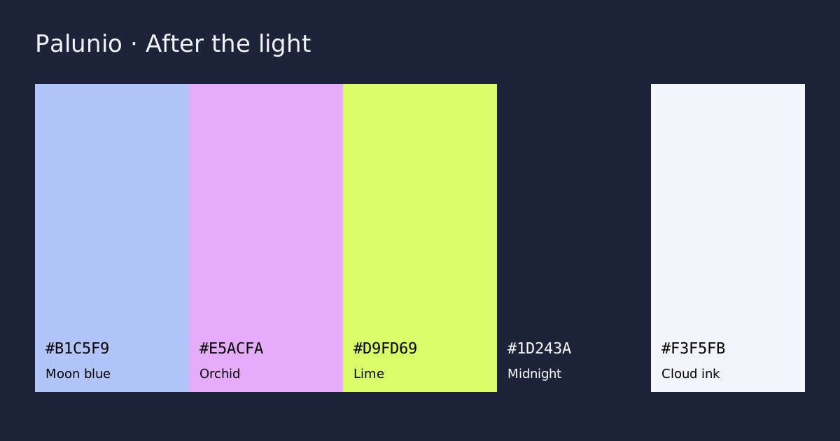
HEX codes and intended roles
| Color | HEX | Role |
|---|---|---|
| Moon blue | Primary | |
| Orchid | Secondary | |
| Lime | Accent | |
| Midnight | Surface | |
| Cloud ink | Ink |
How to use this combination
Use cloud ink for body text and moon blue for underlined links. Orchid can distinguish supporting cards or illustrations. Use lime sparingly for the primary action, paired with midnight text rather than white text.
A SMALL WEBSITE STUDY
After the light
Thoughtful details. A little room to breathe.
Explore the collection →Body text: 14.11:1 · CTA text: 18.20:1
Measured contrast pairs
Ratios use the WCAG 2.2 opaque sRGB formula. Normal text AA needs 4.5:1; large text AA needs 3:1. Labels use the full unrounded result. This table checks pairs, not full accessibility conformance.
| Pair | Ratio | Normal AA | Inspect |
|---|---|---|---|
| Body text on page | 14.11:1 | Pass | #F3F5FB on #1D243A |
| Ink on primary | 1.58:1 | Fail | #F3F5FB on #B1C5F9 |
| Ink on secondary | 1.66:1 | Fail | #F3F5FB on #E5ACFA |
| Ink on accent | 1.06:1 | Fail | #F3F5FB on #D9FD69 |
| Primary as text on page | 8.95:1 | Pass | #B1C5F9 on #1D243A |
| White on accent | 1.15:1 | Fail | #FFFFFF on #D9FD69 |
What to avoid
A bright accent can be tiring across a large dark page. Do not use lime for every border and heading. The scheme does not yet define disabled, hover, error or focus states; check those separately in your component library.
A project example
For a developer product page, use midnight as the main surface, moon blue for inline documentation links and lime for one primary action. Place code samples in a clearly bounded region and retain syntax labels when showing status or errors.
Take the colors into your project
Download CSS variables, DTCG color tokens or a Palunio JSON backup. CSS and tokens use the five roles above. The backup imports into Saved palettes. For print, convert through your printer’s color-managed workflow; these are screen colors.
Next: read the related practical guide, build a primary scale, or compare the other curated palettes.